Home
Projects
Dragon Steakhouse

Dragon Steakhouse App
A modern approach to the traditional restaurant ordering experience
Market Research
Competitive analysis
Personas
User Survey
Wireframes
Flow Diagrams
High-fidelity UI
Prototype
Mini Usability Study
Accessibility Evaluation
Where
Where
Where
Pembrokeshire, UK
What
What
What
Native Mobile App (IOS)
Why
Why
Why
Portfolio Project
Role
Designer, researcher
Category
E-commerce, Food & Drink
When
Nov 2022 - Dec 2022

Why I made this project
“I'm a big fan of steak restaurants and good tasting food. However I spoted a gap in the market - most steakhouse restaurants don't have a food ordering app. I wanted to change that."
Why I made this project
“I'm a big fan of steak restaurants and good tasting food. However I spoted a gap in the market - most steakhouse restaurants don't have a food ordering app. I wanted to change that."
Market Research
Why an app?
Why an app?
Why an app?
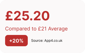
Customers that order through an App tend to spend more money than through tradtional channels. Businesses using app table order services see a 20% increase in customer spend compared to taking orders in person or by telephone.
Customers that order through an App tend to spend more money than through tradtional channels. Businesses using app table order services see a 20% increase in customer spend compared to taking orders in person or by telephone.
Customers that order through an App tend to spend more money than through tradtional channels. Businesses using app table order services see a 20% increase in customer spend compared to taking orders in person or by telephone.
The problem
The problem
The problem
Often customers who are not as technologically literate find it difficult to use food ordering apps.
Often customers who are not as technologically literate find it difficult to use food ordering apps.
Often customers who are not as technologically literate find it difficult to use food ordering apps.
Competitive Analysis
I anaylised 4 food and drink ordering apps in the space - looking at both the odering experience and the checkout process to find patterns and oppinutinties for imporvement.
I anaylised 4 food and drink ordering apps in the space - looking at both the odering experience and the checkout process to find patterns and oppinutinties for imporvement.


The good
Apps looked visually pleasing (App 3 & 4)
Checkout experience was simple
Costa coffee app is easy to use
The bad
No quick and easy way to reorder past orders
Lack of accessibility features (App 1, 2 & 3)
Allergy information is often hard to access
Problems from comments
"I really like the look and feel of the app... It just takes so long to load anything."
"It does take a few times to understand how the App works, it is not as intuitive as other coffee apps"
"Amazing technology - Food came warm and quickly. But the app needs some work"
User survey
I conducted a quick survey among people who order food at steak resturants on Twitter.
User survey
I conducted a quick survey among people who order food at steak resturants on Twitter.

What's the most important factor you take into account while ordering food with a mobile app? 23 Participants
What's the most important factor you take into account while ordering food with a mobile app? 23 Participants
Initial research shows
There is a growing need for a intuitive mobile food ordering app that is easy to use, showcase information about food items clearly.
There is a growing need for a intuitive mobile food ordering app that is easy to use, showcase information about food items clearly.
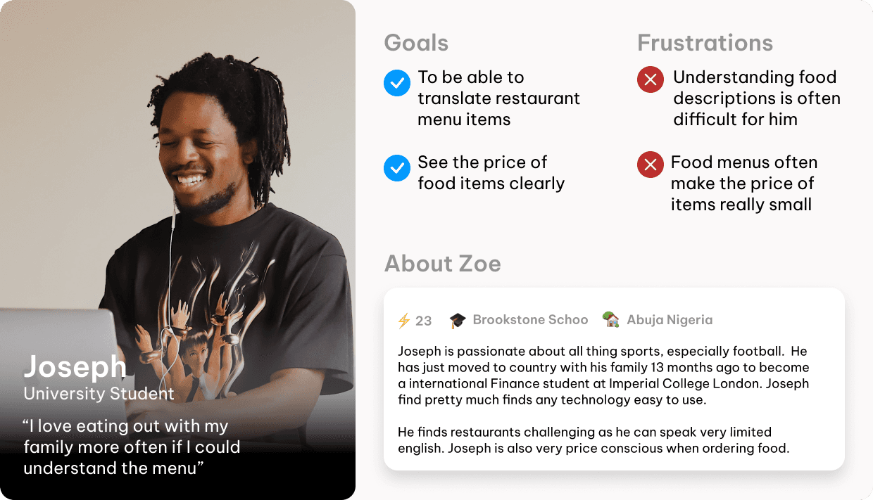
Personas
I created two personas based on two different types of users of the app
I created two personas based on two different types of users of the app

Time to start designing!
Once I went through all my research data it was time sketch out the first flows and intial low-fidelity wireframes.
Once I went through all my research data it was time sketch out the first flows and intial low-fidelity wireframes.
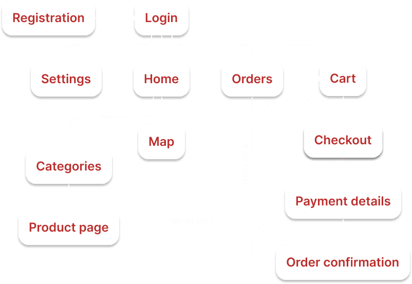
Flow Diagram
To outline all necessary functionailty I created a simple flow diagram of the main tasks the user can do. One of the flows is shown below. Fail state flow were also created, but are not shown due to space constraits.
Flow Diagram
To outline all necessary functionailty I created a simple flow diagram of the main tasks the user can do. One of the flows is shown below. Fail state flow were also created, but are not shown due to space constraits.

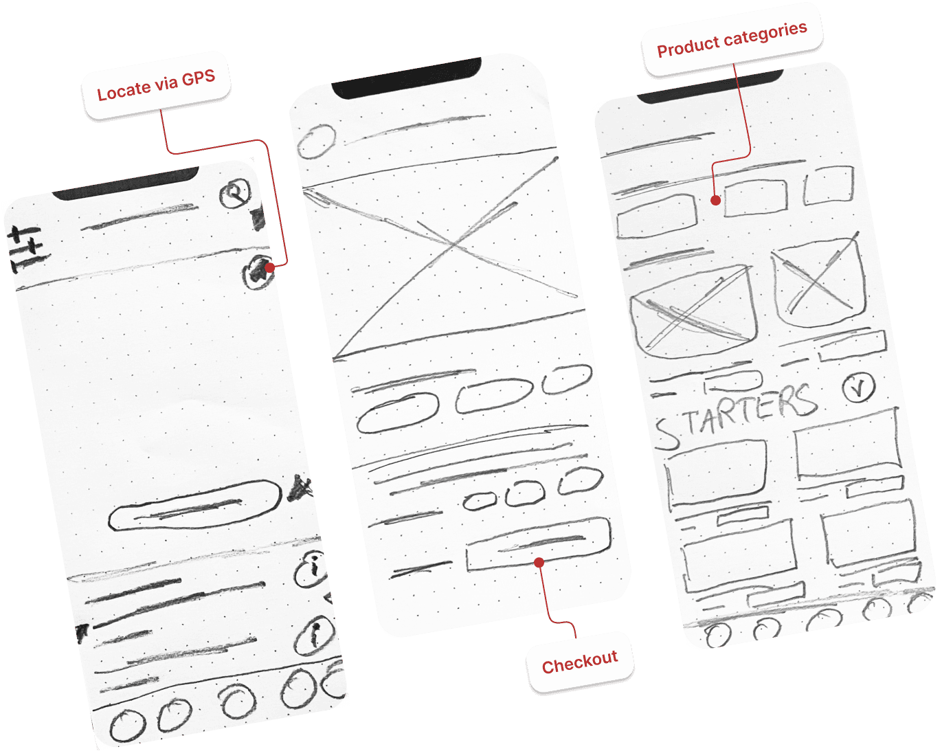
Low-fidelity wireframes
Once the use flow was established, I started creating the low-fidelity wireframes of the main flows.
Once the use flow was established, I started creating the low-fidelity wireframes of the main flows.

High-fidelity UI designs
After the intial flow was complete, I started designing high-fidelity screens for the main user flow. I started by defining the app's fonts and colours.
After the intial flow was complete, I started designing high-fidelity screens for the main user flow. I started by defining the app's fonts and colours.


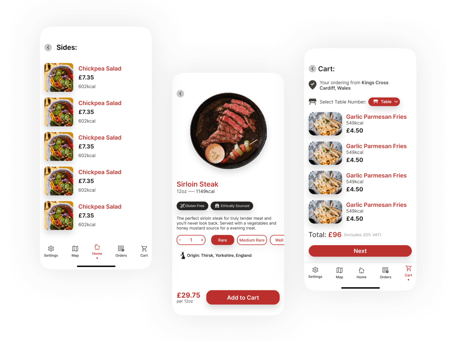
21 High-fidelity screens were created
To improve funuctionility within the app I would create more screens to A/B test certain functionality, like menus and the home screen menu.
To improve funuctionility within the app I would create more screens to A/B test certain functionality, like menus and the home screen menu.

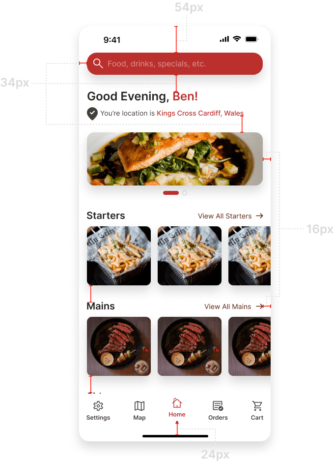
Alignment and grid
I pick a 6 column grid for the project and set the margins for within groups at 14, with margins between groups at 24 and 34. A margin of 54 is between the screen content and the iPhone status bar.
Alignment and grid
I pick a 6 column grid for the project and set the margins for within groups at 14, with margins between groups at 24 and 34. A margin of 54 is between the screen content and the iPhone status bar.
High-fidelity prototype
I connected my high-fidelity designs into a clickable prototype. That allowed me to test the app with the first group of users.
I connected my high-fidelity designs into a clickable prototype. That allowed me to test the app with the first group of users.
Test out the prototype: here
Test out the prototype: here
Prototype validation
I validated my prototype with 3 users. Each were given a subset of the prototype dedicated to users adding items to there cart. I want to be sure that users understand how to find out details about the product and add items to their shopping cart.
This was tested in person, where I introduced the user to the app asked them a few questions about their experience. The questions were dedicated to finding out if the information on the product and adding items to their cart process was easy for them to do.
Study results
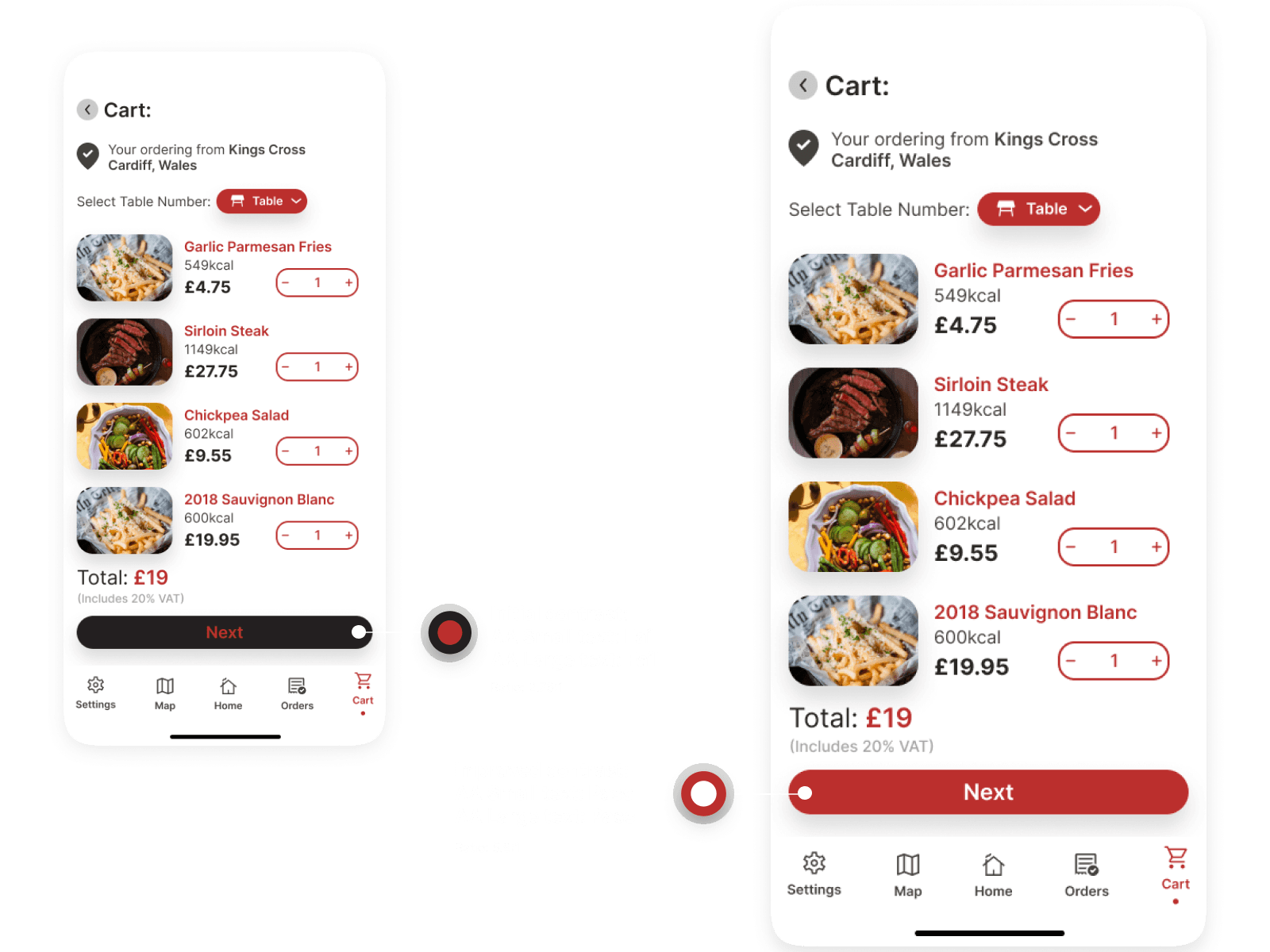
66% (2 out 3) of users wanted to see to more a more detailed description of the food and where it comes from. They understood quickly how to add to cart, however were expecting more information to me shown on the food product page. 100% of the users also not able to edit the ammount of items in their cart and were frustrated by this design decision. As this impacted the main user flow - this problem was a P0 issue for me to fix right away within my designs.
I validated my prototype with 3 users. Each were given a subset of the prototype dedicated to users adding items to there cart. I want to be sure that users understand how to find out details about the product and add items to their shopping cart.
This was tested in person, where I introduced the user to the app asked them a few questions about their experience. The questions were dedicated to finding out if the information on the product and adding items to their cart process was easy for them to do.
Study results
66% (2 out 3) of users wanted to see to more a more detailed description of the food and where it comes from. They understood quickly how to add to cart, however were expecting more information to me shown on the food product page. 100% of the users also not able to edit the ammount of items in their cart and were frustrated by this design decision. As this impacted the main user flow - this problem was a P0 issue for me to fix right away within my designs.
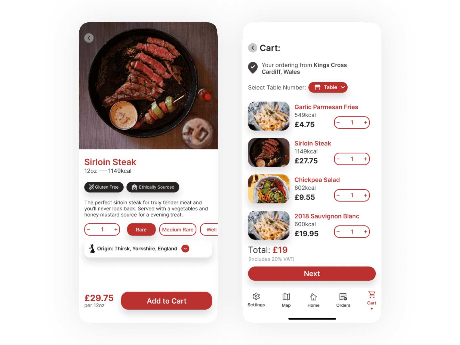
Prototype update concept
Because of time constraints I wasn't able to run a second usability study on the updated prototype. However, I have updated it by moving the add to bag button to the detail page and replacing it with "view more" on the category page.
Prototype update concept
Because of time constraints I wasn't able to run a second usability study on the updated prototype. However, I have updated it by moving the add to bag button to the detail page and replacing it with "view more" on the category page.
Test final prototype: here
Test final prototype: here
Accessiblity check
The app has been evaluated for contrast to match AA standards of WCAG. In some cases I found that the contrast could be improved.
The app has been evaluated for contrast to match AA standards of WCAG. In some cases I found that the contrast could be improved.
Project thoughts
During the project, I managed to evaluate the market and conduct a quick user survey using Twitter. I also performed a mini usability study, created a set of low-fidelity wireframes, built a functional prototype, and developed them into high-fidelity, beautiful UI designs. In the last checkout round, I also conducted an extensive quality assurance audit, focusing on consistency and colour contrast with regards to accessibility guidelines.
During the project, I managed to evaluate the market and conduct a quick user survey using Twitter. I also performed a mini usability study, created a set of low-fidelity wireframes, built a functional prototype, and developed them into high-fidelity, beautiful UI designs. In the last checkout round, I also conducted an extensive quality assurance audit, focusing on consistency and colour contrast with regards to accessibility guidelines.
Let's work together!
Copyright Matthew Mason 2023
Pembrokeshire, UK